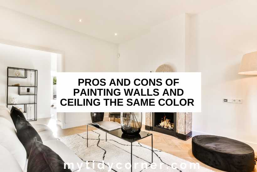
Painting The Ceiling Same Color As Walls

I remember staring at my first apartment ceiling with a kind of bewildered dread. It was that… builder’s beige. You know the one. The color that screams “I’ve given up, but I’ve also managed to hire someone who can paint.” It was dull, it was bland, and it made my already not-huge living room feel even smaller and more… uninspired. For weeks, I lived with it. Every time I looked up, it was like a sigh in paint form. Then, one rainy Saturday, fueled by lukewarm coffee and a sudden burst of DIY bravado, I decided it was time for a change. I was painting the walls a lovely, calming sage green, and I just kept looking at that beige ceiling, thinking, “Why not?”
My rational brain, bless its cautious heart, whispered, “Uh, people don’t usually paint the ceiling the same color as the walls, dude.” But my gut, the one that had been craving something a little more intentional in my living space, was yelling, “GO FOR IT!” And so, amidst a cloud of green paint fumes and questionable life choices, I did. And you know what? It was a game-changer. Seriously, a total, unexpected, wow moment.
That’s where we’re diving today, my friends. We’re going to talk about something that might seem a little unconventional, a little… dare I say, audacious? We’re talking about painting your ceiling the same color as your walls. Is it a design crime? Is it a stroke of genius? Let’s find out.
The "But It's the Ceiling!" Dilemma
Let’s address the elephant in the room, or rather, the beige rectangle on the ceiling. For generations, the ceiling has been the forgotten frontier of home decor. It’s the blank canvas that’s almost always left… well, blank. Or at best, a stark, clinical white. And there’s a reason for that, right? White is safe. White is bright. White expands space. Or so we’ve been told. It’s the default setting, the paint-by-numbers approach to the fifth wall. And honestly, for a long time, I thought that was just the way it was. You paint the walls, you maybe add a pop of color with a rug or some cushions, and the ceiling? It’s just… there. A place for light fixtures and cobwebs, mostly.
But then you start noticing things. You see magazine spreads, you scroll through Pinterest, and you start to see spaces that feel… different. Cohesive. Immersive. And often, the secret ingredient is that fifth wall getting some love. It’s a concept that can feel a bit intimidating at first. It’s like, “Am I allowed to do that?” The answer is a resounding, absolutely yes! Your home, your rules, your paint choices. Don’t let outdated design norms hold you back from creating something truly special.
The Magic of Monochromatic Moments
So, why does painting the ceiling the same color as the walls actually work? It’s all about creating a sense of continuity and cohesion. Think of it like wearing a perfectly matched outfit. Everything flows. There are no abrupt lines or jarring transitions. When your walls and ceiling are the same color, you create an immersive environment. The room feels more enclosed, more intimate, and in many cases, surprisingly larger.
This is especially true if you’re using darker or bolder colors. Painting a dark ceiling white can make it feel like it’s hovering above you, creating a visual separation that can make the room feel chopped up and smaller. But when that dark color continues upwards, it blurs the lines between wall and ceiling, drawing your eye upwards and making the room feel like a continuous, enveloping space. It’s like stepping into a beautifully painted box, but in the best possible way. You know those moments when you walk into a room and it just feels right? This is often how that feeling is achieved.
It’s a trick that designers have been using for ages, and it’s surprisingly effective. It’s a subtle change that has a profound impact on the overall atmosphere of a room. It can make a small room feel like a cozy sanctuary, or a large room feel like a grand, yet unified, statement.
Making a Statement with Color
Now, let’s talk about color. This approach is particularly impactful when you’re working with richer, deeper hues. Imagine a deep navy blue, a forest green, or a warm terracotta. Painting these colors on the walls alone can be stunning, but extending them to the ceiling? That’s where the real magic happens. It transforms the room into a jewel box, a sophisticated retreat. It feels intentional, curated, and utterly chic. You’re not just decorating a room; you’re creating an experience.
Think about it: a deep, moody charcoal gray on the walls and ceiling. Suddenly, the room feels incredibly intimate and luxurious. The light plays off the color differently, creating depth and shadow. Or a vibrant emerald green? It’s like being in a lush, botanical oasis. It’s bold, it’s dramatic, and it’s undeniably stylish. And don’t even get me started on the possibilities with jewel tones like sapphire or amethyst. It’s like wrapping yourself in a warm, colorful hug. You might be thinking, “But what about the light?” We’ll get to that. Don't you worry.
This is also a fantastic way to hide imperfections. Let’s be honest, ceilings aren’t always perfectly smooth. A coat of paint that matches the walls can help to camouflage minor bumps and divots, making your DIY efforts look even more professional. It’s a little secret weapon for a flawless finish.
When White Just Isn't Enough
For many, white is the go-to for ceilings because it’s perceived as making a room feel brighter and more spacious. And yes, a crisp white ceiling can do that. But it can also feel a bit sterile, a bit… unfinished. It can create a stark contrast with your wall color, especially if your walls are a muted or darker shade. This contrast can actually make the room feel smaller, because your eye is constantly being drawn to the visual break.
When you paint the ceiling the same color as the walls, you eliminate that jarring contrast. Instead, you create a seamless transition that allows the eye to flow. This can make the room feel more expansive, paradoxically. It’s like when you look at a perfectly framed picture; the frame defines the image. But when the image extends beyond the frame, or the frame is the same material as the wall it’s on, it feels more integrated and intentional. You're essentially blurring the boundaries and creating a unified visual field.

Plus, let’s be real, sometimes white is just plain boring. If you’re going to invest the time and effort into painting, why not make it count? Why not choose a color that speaks to you, that makes you feel something, and extend that feeling to the entire room? It’s about embracing a more holistic approach to design. It's about creating a space that truly reflects your personality and your style. Don't settle for "fine" when you can have "fabulous."
The "What About Light?" Question
Ah, the age-old question: “But won’t it make the room dark?” This is a valid concern, and the answer is… it depends. If you’re painting a small, north-facing room with minimal natural light a deep, matte black, then yes, it’s probably going to get a bit moody. But for most situations, it’s not the dramatic darkness you might be imagining. Remember, light reflects. And when you have a consistent color all around, the light bounces around more evenly.
Consider the finish. A satin or eggshell finish on the ceiling will reflect more light than a matte finish, helping to keep the space feeling bright. If you’re concerned about light levels, you might choose a slightly lighter shade of your wall color for the ceiling, or opt for a paint with a bit more sheen. Many paint companies offer a wider range of finishes for their colors, so you can often find the perfect balance between color saturation and light reflectivity.
And let’s not forget about your light fixtures! A well-chosen pendant light or some strategic lamps can make all the difference. In fact, a beautifully painted ceiling can become a feature in itself, and a well-lit one will really make that color pop. Think about how dramatic a dark ceiling can look when a beautiful chandelier is hanging from it. It’s not just about avoiding darkness; it’s about embracing a different kind of ambiance. It’s about creating a space that feels warm, inviting, and intentionally designed. So, don't let the fear of darkness stop you from exploring this incredible design option.
Creating a Cozy Cocoon
One of the most significant benefits of painting your ceiling the same color as your walls is the feeling of coziness and intimacy it creates. It’s like wrapping yourself in a warm blanket. The boundaries of the room soften, and the space feels more enclosed, more secure. This is particularly effective in bedrooms, reading nooks, or any space where you want to cultivate a sense of calm and relaxation.

Imagine a bedroom painted in a soft, dusky rose. When the ceiling is the same color, the room feels like a warm embrace. The light is diffused, and the overall atmosphere is incredibly serene. It’s a space designed for rest and rejuvenation. It’s the perfect antidote to a chaotic world outside. You can literally create your own personal sanctuary, a haven of calm and comfort. It’s a way to make your personal space feel truly yours.
This technique can also be a lifesaver in awkwardly proportioned rooms. If you have a room with a very high ceiling, painting it the same color as the walls can visually bring the ceiling down, making the space feel more grounded and less cavernous. Conversely, in a room with a low ceiling, it can create the illusion of more height by blurring the lines and making the entire space feel unified. It’s a clever visual trick that can dramatically improve the perceived proportions of a room.
The "Wow" Factor and Design Confidence
Let’s be honest, there’s a certain “wow” factor that comes with painting your ceiling the same color as your walls. It’s unexpected, it’s bold, and it shows a level of design confidence that’s truly admirable. When guests walk into a room like this, they’re going to notice. They might not even be able to articulate exactly why it feels so different, but they’ll feel it. It’s the difference between a room that’s just “decorated” and a room that feels thoughtfully designed.
It’s a way to step outside the box and create a space that’s uniquely yours. It shows that you’re not afraid to take risks, and that you understand the power of a cohesive design. It’s a conversation starter, for sure! People will ask about it, and you can proudly tell them that you took a leap of faith and it paid off beautifully. It’s a way to infuse your personality and your style into every corner of your home. You’re not just choosing a paint color; you’re crafting an atmosphere.
And for the DIYers out there, it’s a fantastic way to elevate your skill level. It shows you’re willing to tackle a project that might seem a little more advanced, and the results will speak for themselves. It’s a statement of your commitment to creating a beautiful and intentional living space. So go on, be brave. Experiment. You might just surprise yourself with what you can achieve.

A Word on Finishes and Test Patches
Before you dive headfirst into gallons of paint, a couple of practical tips. Always, always do a test patch! Paint a good-sized swatch on your wall, and yes, even a patch on the ceiling if you can manage it safely. Observe it in different lights throughout the day. Colors can look drastically different depending on natural light, artificial light, and even the surrounding colors in the room. What looks amazing in the store might be a little too intense or too dull in your actual space. Patience here is key.
Also, consider your finish. As we touched on, a satin or eggshell finish on the ceiling can help bounce light around, which is great for making the space feel brighter. A matte finish will absorb light, creating a more velvety, sophisticated look, but it can make a room feel dimmer, especially with darker colors. For walls, a durable eggshell or satin is usually a good choice for most rooms, offering a bit of sheen without being too reflective. The key is to choose finishes that work together and complement your chosen color and the mood you want to create.
And remember, a smooth, well-prepped surface is your best friend. Wipe down those walls and ceilings, fill any holes, and consider a primer if you’re going from a drastically different color. The better your prep, the more professional your final result will look. Nobody wants to see brush strokes that look like they were applied by a toddler, right? Trust me on this one. Good prep makes for a happy painter.
The Takeaway: Embrace the Possibility!
So, there you have it. Painting the ceiling the same color as the walls is not just a trend; it’s a powerful design tool. It can make a room feel more cohesive, more intimate, and surprisingly more spacious. It’s a way to embrace color more fully, to create a truly immersive experience, and to infuse your home with your personal style.
Whether you’re drawn to bold, dramatic hues or soft, calming neutrals, this technique can elevate your space from ordinary to extraordinary. Don’t be afraid to break the mold. Don’t let the “way it’s always been done” hold you back. Your home should be a reflection of you, and sometimes, that means taking a few creative risks. So, the next time you’re contemplating a room refresh, consider painting that fifth wall. You might just discover a whole new dimension to your home.
And if you do it? Please, I’m dying to know! Tag me, send me pictures, tell me all about it. Let’s inspire each other to create more beautiful, intentional spaces. Go forth and paint fearlessly!