Paint Colours To Go With A Cream Kitchen

Alright, settle in, grab your favourite mug (mine’s currently overflowing with a questionable amount of coffee, shhh!), because we need to chat about something super important. Your cream kitchen. Oh, the humble, elegant, wonderfully versatile cream kitchen! It’s like the best friend of kitchen colours, isn’t it? Always there, always chic, never trying too hard. But sometimes, even the best friends need a little pizzazz, a fresh outfit, a new vibe. And that, my dear, is where paint colours come into play!
You’ve got those gorgeous cream cabinets, right? Maybe they’re a rich, buttery hue, or perhaps a softer, almost off-white cream. Whatever their exact shade, they’re basically a blank canvas, just begging for some colourful companionship on the walls. It’s like, "Hey walls, let's make some magic!" And trust me, the options are endless. So much so, it can feel a little... overwhelming, maybe? Like standing in front of the world's biggest ice cream counter and not knowing where to start. Been there, bought the extra scoop.
Choosing the right paint colour can seriously transform your entire kitchen. It can make it feel bigger, cozier, brighter, more dramatic… you name it! It’s like giving your whole space a personality makeover. And with cream cabinets, you have so much freedom. They’re just so darn flexible. Let's unlock that potential together, shall we?
The Wonderful World of Cream: Why It’s Your Best Friend
First off, let’s just take a moment to appreciate cream. It's not stark white, which can sometimes feel a bit clinical, can it? No, cream brings a lovely warmth. It’s inviting, timeless, and just inherently comforting. It's sophisticated without being stuffy, and traditional without being dated. Plus, it plays well with practically everything. Seriously, it's the ultimate team player in the kitchen design game.
Think about it: it can lean traditional, farmhouse, modern classic, even a bit Scandi with the right pairings. It's not demanding; it just is. And because it's so beautifully neutral, it gives you so much freedom with your wall colours. We’re talking full-on creative license here! No need to feel boxed in. It’s the perfect backdrop, ready to highlight whatever gorgeous colour you choose to put next to it.
So, don't ever think of cream as "boring." It's not boring; it's brilliant. It allows your walls to truly sing without ever clashing or competing. It's the grounding force, the steady beat in your kitchen's symphony. And now, let's pick the melody!
Navigating the Colour Sea: Where Do We Even Begin?
Okay, so cream is fabulous. We’ve established that. Now, how do we make those walls sing without clashing, or worse, making the whole room feel... meh? We want a kitchen that says, "Come in, stay a while, maybe have a biscuit (or five)." Not one that whispers, "Don't touch anything!" Right? Right.
The key is to think about the feeling you want in your kitchen. Do you want serene and calm? Energetic and vibrant? Cozy and intimate? The paint colour can literally transform the mood of the entire space. It’s powerful stuff! So, let’s dive into some glorious options, shall we? We’ll explore colours that either echo cream’s warmth, provide a gentle contrast, or offer a bold statement. Ready for a little colour adventure?
Embracing the Neutrals: Layering is Your Friend
I know, I know, "neutrals" can sometimes sound a bit... boring. Like oatmeal, right? But with cream cabinets, layering different shades of neutrals can create an incredibly sophisticated and utterly seamless look. It’s all about creating depth and subtle variation, so your kitchen feels rich, not flat. It’s about creating a harmonious flow, where everything just works together. Think of it as a beautifully tailored outfit – understated, yet undeniably chic.
Warm Greiges and Taupes: The Sophisticated Chameleons
If your cream leans a little more golden or beige, a warm greige or a soft taupe on the walls can be absolutely divine. These colours are like the ultimate sophisticated hug for your kitchen. They’re not grey-grey, you know? They have those lovely warm undertones that pick up on the warmth of your cream cabinets, making everything feel cohesive and intentional. They bridge the gap between grey and beige, offering the best of both worlds.
Think Farrow & Ball's Elephant's Breath, a classic for a reason, or perhaps Little Greene's Slaked Lime Mid. These aren't just colours; they're moods! They have that wonderful, almost elusive balance between warm and cool, creating a backdrop that feels incredibly sophisticated. They manage to be modern and utterly timeless all at once. Like that perfect trench coat you can wear forever, you know? They just work. They let your cream cabinets breathe, letting them be the star without ever feeling like the walls are shouting for attention. It’s like a quiet, appreciative nod from your walls to your cabinetry. A subtle wink of perfection, really.
These shades are fantastic for creating a calm, collected atmosphere. They’re grown-up, elegant, and frankly, pretty foolproof. Especially if you're a bit nervous about diving into bolder colours. This is your safe, stylish harbour. They also pair wonderfully with natural wood tones, making any timber accents in your kitchen really sing.
Soft, Barely-There Off-Whites: The Illuminators
Okay, hear me out. More off-white. Yes! But we’re talking about an off-white that has a different undertone than your cream. Maybe one with a hint of grey, or a touch of a very pale, muted green, or even a whisper of blue. This creates a subtle contrast that brightens the room without making your cream cabinets look dingy. That’s the absolute last thing we want!
It keeps the space feeling open, airy, and super fresh. Perfect if your kitchen isn't massive, or if you just adore that bright, clean aesthetic. It’s understated elegance at its finest. Think about how a crisp white shirt makes a difference to an outfit. Same principle! It highlights the richness of your cream without screaming for attention.
Look for off-whites with a very subtle cool undertone to contrast beautifully with your warm cream. It’s like a soft sigh of fresh air in your kitchen, making it feel expansive and utterly serene. Imagine how the sunlight would dance around a room painted in such a delicate shade. Pure bliss!
Dipping Our Toes in Colour: Greens and Blues
Alright, feeling a little braver now? Let's talk about bringing nature indoors. Because, honestly, what goes better with warm cream than the serene, calming hues of the natural world? They just feel right, don’t they? Like a perfectly paired wine and cheese. These colours introduce a natural, organic feel that perfectly complements the welcoming warmth of cream.
Sage and Olive Greens: The Earthy Embrace
Oh, sage green with cream cabinets. Is there anything more soothing? It’s like a peaceful meadow just took up residence on your walls. These greens are muted, sophisticated, and incredibly calming. They don't scream for attention; they simply are. They invite you to relax, to breathe, to just be.
An olive green, especially a slightly deeper one, can add a touch of sophisticated drama without being overpowering. It feels organic, grounded, and utterly chic. It’s a fantastic choice if you want to bring an organic, farmhouse, or even a classic country feel to your cream kitchen. Pair it with some wooden accents, maybe a terracotta pot or two, and you’re basically living in a magazine spread. It’s sophisticated country charm at its very best.
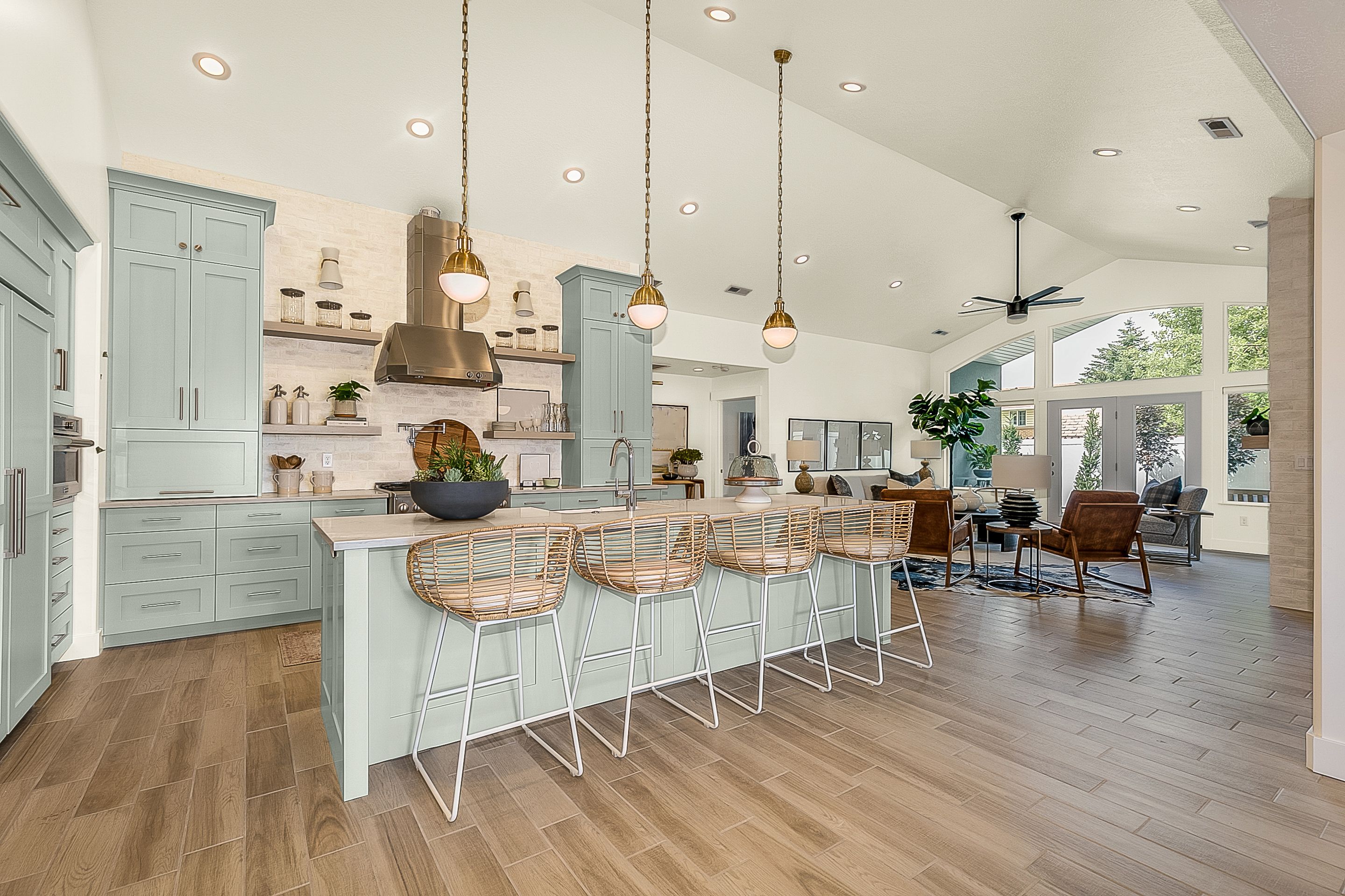
Think about how these greens reflect light – they can feel airy during the day and incredibly cozy at night. Plus, green is just good for the soul, isn't it? It connects us to the outdoors, even when we’re stuck doing dishes. A little mental trickery, perhaps? They make cream feel richer, deeper, and even more inviting.
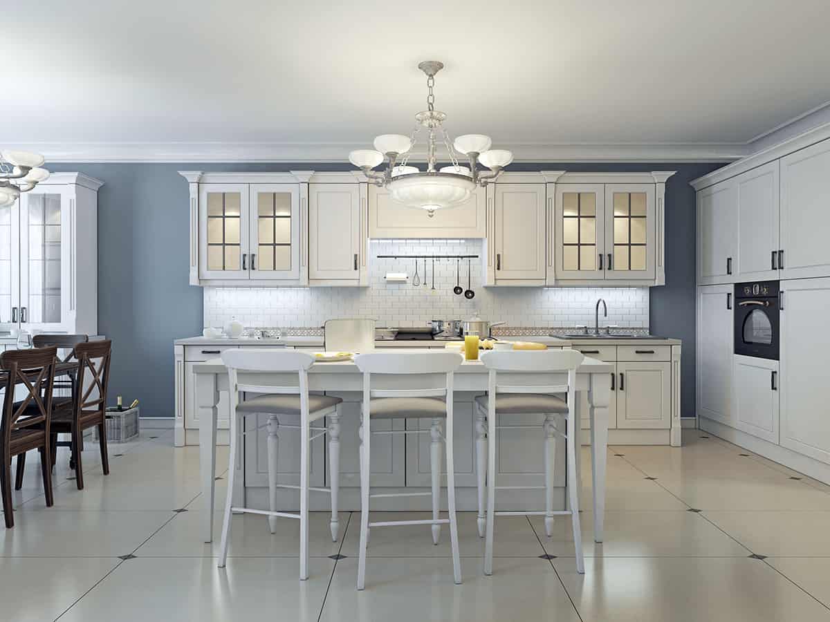
Dusty Blues and Soft Greys-Blues: The Calm Collectors
If green isn't quite your jam, but you still crave that serene, calming vibe, then dusty blues or soft grey-blues are your new best friends. These colours are like a gentle breath of fresh air. They bring a touch of coolness that beautifully balances the warmth of your cream, creating a harmonious contrast. It's a combination that feels instantly classic and incredibly sophisticated.
Imagine a delicate sky blue, or a more muted, almost denim-like blue. They’re not aggressive; they're inviting. They can make a smaller kitchen feel larger and more open, reflecting light beautifully. A dusty blue can evoke a coastal feel, without having to actually live by the sea (though, one can dream, right?). It’s that laid-back, effortlessly elegant vibe.
For something a bit more substantial, but still incredibly serene, look at those blues that have a touch of grey in them. They’re sophisticated, classic, and always in style. They pair wonderfully with natural wood tones and metallic accents like brass or brushed nickel. Utterly dreamy. They turn your cream cabinets into something even more special, enhancing their soft glow.
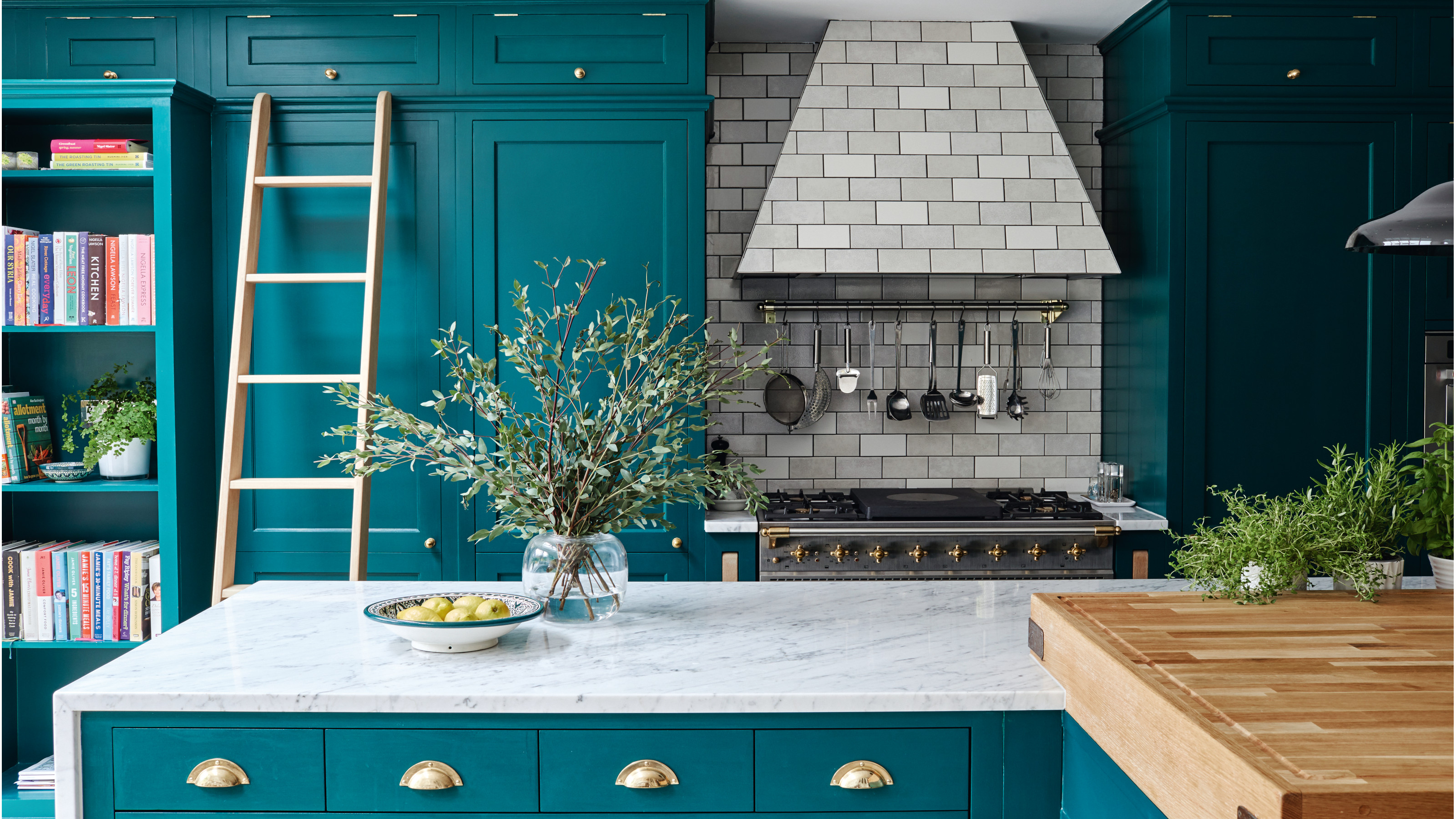
Navy Blue: The Statement Maker
Feeling bold? Really want to make those cream cabinets pop? Then navy blue is calling your name! Oh, it’s dramatic, it’s sophisticated, and it’s surprisingly versatile. Against cream cabinets, navy isn't just a wall colour; it's a statement. It’s a deep, rich hue that commands attention in the best possible way.
It creates a really striking contrast, making your cream cabinets look even richer and brighter. It’s a great choice for a feature wall, or if you have a kitchen that gets a lot of natural light and can handle the depth. Think about how sharp a cream blazer looks with a navy blouse. It’s that kind of effortless chic, a truly timeless combination that just exudes confidence.
Add some brass hardware, perhaps a few vibrant green plants, and suddenly your cream kitchen has gone from lovely to absolutely spectacular. It’s a commitment, yes, but oh, what a rewarding one! It feels luxurious, doesn't it? Navy offers depth and gravitas, grounding the warmth of the cream and giving your kitchen a truly high-end feel. It says, "I've arrived, and I look fabulous."
Unexpected Delights: Pinks and Terracottas
Okay, prepare yourselves, because we’re veering into slightly more adventurous territory. But in the best possible way! These colours can bring so much personality and warmth that you didn't even know your cream kitchen was craving. They're like that delightful surprise guest who brings all the fun to the party.
Soft Blushes and Muted Pinks: The Gentle Hug
Don't run away! I'm not talking about Barbie pink, bless her heart. I'm talking about those utterly gorgeous, super-soft blushes, muted rose tones, or even a subtle terracotta-pink. These shades, against cream, create an incredibly warm, inviting, and surprisingly modern feel. They're sophisticated, not sugary.
They add a touch of playful femininity without being overly sweet. They bring a gorgeous warmth that complements cream beautifully, making the whole room feel cozy and joyful. It’s unexpected, yes, but oh-so-charming! Imagine a kitchen that always feels sunny and bright, even on a gloomy day. That's the power of blush. It can infuse a gentle glow that feels both fresh and comforting.
It’s perfect if you want to infuse a bit of personality and a less traditional vibe into your cream kitchen. Think about it: a little dose of happy every time you walk in. Who wouldn't want that? These soft pinks truly make cream feel luxurious and contemporary, pushing your kitchen into a more designer-led space.
Venturing into the Darks: Bold and Beautiful
For the brave souls among us, the ones who aren't afraid to go dark! A deep, rich colour on the walls can create an incredibly dramatic and sophisticated backdrop for your cream cabinets. It’s like putting your cabinets in a spotlight, making them the undeniable stars of the show. This choice isn't for the faint of heart, but the reward? Absolutely stunning.
Deep Charcoal or Rich Plum: The Drama Queens
A deep charcoal grey, almost black, can be breathtaking. It’s sleek, modern, and oh-so-chic against cream. It works exceptionally well in kitchens with plenty of natural light, preventing the space from feeling too heavy. It’s sophisticated, urban, and totally unapologetic. It provides a striking contrast that makes your cream cabinets really pop, almost glow against the dark backdrop.
Or, for something even more unexpected, how about a rich, deep plum or a dark, moody berry? These colours are pure luxury. They’re warm, inviting, and incredibly unique. They create a wonderfully cocooning effect, perfect for an evening kitchen vibe. Just imagine it with some soft lighting – pure magic! It’s like wrapping your kitchen in velvet. These colours are conversation starters, instantly making your kitchen feel unique and personal.
These choices are definitely for those who want their kitchen to make a statement, to feel like a carefully curated space. It's not for the faint of heart, perhaps, but the payoff is huge. It proves that dark colours can be incredibly welcoming and add an unparalleled depth to a room, especially when balanced by the softness of cream.
Important Things to Ponder Before You Paint!
Before you grab that paintbrush and a gallon of 'Enchanted Forest Green', let’s have a quick reality check. Because even with the perfect colour, a few practical considerations can make all the difference. We want stellar results, not a paint-induced headache, right?
Light, Light, Light!
How much natural light does your kitchen get? And from what direction? North-facing rooms often have cooler light, while south-facing rooms get warm, bright light. This seriously affects how a colour looks. What seems perfect in a photo might look totally different in your space. Artificial lighting also plays a huge role. Warm bulbs versus cool bulbs? Massive difference. Observe your room throughout the day; that perfect evening hue might look entirely different in the stark morning light.
Room Size Matters
Darker colours can make a small room feel cozier, but also smaller. Lighter colours tend to open things up. Think about the overall scale and what you want to achieve. No one wants to feel like they're cooking in a shoebox, unless that's your vibe! If you have a smaller kitchen, a lighter shade on the walls can really help it feel expansive, while a larger kitchen might be able to handle a dramatic, darker colour with ease.
Consider Your Existing Elements
What about your countertops? Your flooring? Your backsplash? Do they have warm or cool undertones? You want your paint colour to harmonise with these fixed elements, not fight with them. It’s about creating a symphony, not a chaotic jazz solo. Take photos of these elements and refer to them when looking at paint samples. They are part of the permanent team, so your new paint colour needs to be a good teammate.
And For Goodness Sake, Test, Test, Test!
Please, please, please get sample pots! Paint large swatches on different walls in your kitchen. Live with them for a few days. See how they look in morning light, midday sun, and under your evening kitchen lights. This is the absolute best advice anyone can give you. A tiny chip in the store is NOT the same as a wall of colour. Trust me on this one. It's worth the extra effort (and tiny expense!) to avoid a colour catastrophe. You wouldn't buy a car without a test drive, would you? Treat your walls the same way!
The Finishing Touches: It's Not Just About Paint!
Remember, paint is just one piece of the puzzle! Once you've got your fabulous new wall colour, think about accessories. Beautiful wooden chopping boards, vibrant plants, lovely artwork, a quirky rug, even the colour of your tea towels can pull the whole look together. Textures, metallics, ceramics – they all contribute to the overall feeling. It's the icing on the cake, or perhaps, the sprinkles on the cupcake! These small details can reinforce your chosen colour palette and add personality, truly making the space yours.
So, What's Your Kitchen's Story Going to Be?
Your cream kitchen is already beautiful. It's a fantastic foundation. Now, it's your turn to inject your personality, your style, your flair into the space. Whether you go for subtle sophistication, earthy calm, dramatic flair, or a touch of playful blush, the right paint colour will elevate your cream kitchen from lovely to absolutely unforgettable.
Don't be afraid to experiment, to trust your gut, and most importantly, to have fun with it! It’s just paint, after all. If you don't love it, you can always change it. But I have a feeling, with a little thought and a lot of heart, you're going to create something truly wonderful. Now, go forth and colour your world! (And maybe send me a picture, I'm dying to see it!).